The prompt for this assignment was to come up with an idea and name for a museum and design a visual identity system for it. Then design:
Logo design + typeface selection
Brand color palette
Business card
Something for the gift shop (bag, apparel, etc.)
Brand color palette
Business card
Something for the gift shop (bag, apparel, etc.)
I love food (who doesn't?), and I have always been grateful that there are many different cuisines to choose from when I decide to eat out! There is so much cultural history behind the distinct culinary characteristics of different regions and the people that live there that I thought the study of food and culture deserved to have its own museum! Can you imagine a museum where you not only get to learn by visually observing, but also by tasting traditional dishes from all around the world?!?!

Mood board & color palette. Unsure about the green, I might have just thrown that in there as more of an accent color (kind of like how chopped herbs are often sprinked on top of a dish for touch!).
I would imagine that this type of museum would really put an emphasis on people, so I felt that a handwritten brush typeface would be good for quotes and little tidbits like "Food is culture." Maybe headers? For body text, I couldn't imagine using a san serif because that would give too much of a modern feel; I felt that a serif would keep everything looking more "traditional," and tradition is a big part of food & culture!
The fonts I used in the moodboard and decided to be the fonts for any informational materials (like brochures) are Manus and Calluna.

Sketches for a logo

Decided to go with a plate-like thing as the logo. Perhaps the circular-ness can also represent a globe?? Hmm...
I used Brandon Grotesque for the logo. I tried to avoid using sans serif (for the reasons stated above), but it was extremely difficult trying to use a serif font without the entire logo looking completely outdated. Using the brush font was out of the question; it took up too much space since the name of the museum was so long. Overall, I like the look of Brandon Grotesque for just the logo; it keeps the entire museum from looking outdated, while Manus and Calluna for everything will complement the museum's emphasis on people & tradition.

Business card
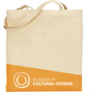
Gift shop tote bag!

Final logo! Got rid of Brandon Grotesque just cause I couldn't sit with a modern typeface.

Wayfinding & signage

Website mockup

